|
Goodbye Comic Sans
Posted by Doug on Wed Jul 17, 2019
Alright so I finally stopped using Comic Sans for all the title/header fonts on this website. Are you happy?!?! Huh?? If you don't know what I'm talking about, then click here to see what the site used to look like. The horror, right? If you still don't know what I'm talking about, if you think the site looks pretty cool with that font, or you just don't care (more likely), well I'm with you. But web design nerds get super frothy about Comic Sans. There's even a whole section in Wikipedia devoted to "opposition" to this font. Like it's a radical political movement or something. Here's a quote by the font's creator that sums things up nicely:
“
If you love it [Comic Sans], you don't know much about typography [but] if you hate it, you really don't know much about typography, either, and you should get another hobby.
”
Joke's On You, Design Nerds!
Now you may have the impression that the design nerds have strong-armed me into submission. Ha! Quite the opposite! It's me who tricked them. That's right! In two devious ways:
- First of all, it's not even Comic Sans, you fools! The font is called Comic Neue, and I recommend reading through that site for more backstory and philosophy. I originally wanted to use plain old Comic Sans but quickly realized that the Opposition has managed to oust the font from most platforms, especially mobile devices. So using Comic Neue was the only special ops insurgent way to slip it in. It's basically downloaded from aytwit.com itself and "injected" into your browser. You can't do the same with Comic Sans because of Microsoft's licensing limitations. Or at least there's enough big lawyer words to scare me off. Note I'll continue to use the name Comic Sans below even though again it's not really Comic Sans.
-
The second way I've tricked the Opposition is much more sneaky. You see, I weaponized their hatred of Comic Sans against them. The plot is subtle so pay attention. About a year ago I submitted this site to Hacker News to get some feedback. It's notoriously hard to get any traction on that site so I was counting on somebody at least making a comment about the font. And bingo! A commenter named "trillic" fell right into the trap:
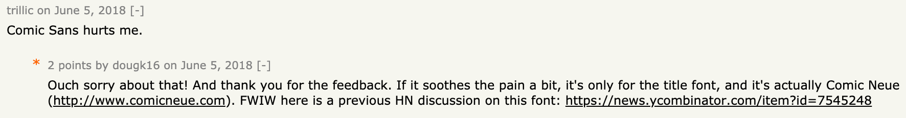 They wrote that comment just as my post was about to slip off the front page into oblivion. That single comment boosted the post back up, getting me a few more upvotes and eyeballs. It's nothing like the reception that Thoughter received (or the follow-up blog post), but hey a trap is a trap, I can't control what falls in. The point is it worked!
Why Use Comic Sans In the First Place You Damn Hipster?
Great question. I didn't do it just to piss people off. There are actually some legit reasons if you can believe it:
- As I'm sure you noticed, this site looks pretty old school, like something from the 1990s, but with suspicious smells of the future. Like a DeLorean. I designed the site this way intentionally, because I happen to think that the 90s web was pretty damn awesome. Sites were lightweight, static documents all linked together with predictable behavior and not tracking the shit out of you and sniffing up your empty colon afterwards. The fact that they were "ugly" doesn't really matter. I don't care if a tool in my garage is all rusty, stained with blood and grease and sweat, as long as the cutting edge is honed and ready for action. So anyway, Comic Sans was my way of putting a bold stamp on my nostalgic leanings.
- Aytwit's thought bubble icon
 is inspired from comic books, and the question mark inside the bubble is Comic Sans. So the font made sense as far as matching that branding.
 - I actually really like the font. And I like the fact that people don't like it because then using it is a good reminder to not take things too seriously when people yell at you to not use it...if that makes sense.
- And yea as mentioned I knew it would piss people off and was hoping for at least negative feedback. I used to be scared of negative feedback, but after years of no feedback on all kinds of projects that I poured my soul into, I've learned negative feedback is a blessing so I chase it however I can. I'm not good enough to chase positive feedback yet.
Alright So Why Get Rid Of It Now?
I really wanted to make Comic Sans work, but in the end I had to remove it, for many reasons:
- Well for one, it gave me great material for a blog post about getting rid of it. But in seriousness, it's mostly for technical reasons...
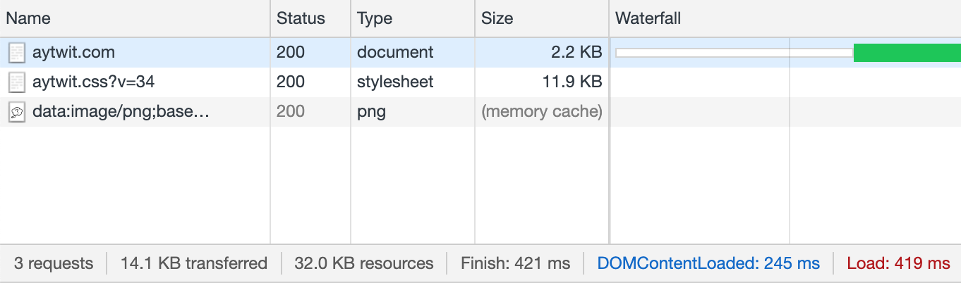
- The font increased the total size of every page on this site by 45 kilobytes because it had to be embedded in the site's CSS. Click here to see what that embedding looks like. 45 kilobytes is actually nothing when you consider that most "modern" websites are downloading tens of megabytes of crap. But I have very strict standards for visitors' experience. Even if you're downloading by carrier pigeon, it should only take, well, a few pigeons. To be more exact, the main page weighs in at a mere 14 kilobytes now:
- Windows was rendering the font in a crappy jagged way, I believe on Internet Explorer, but I can't reproduce now and show you a picture. But trust me it made the site look legitimately broken and not just Comic Sans-ugly.
- This probably isn't Comic Sans-specific, but on mobile devices the custom font was contributing to choppy scrolling. Once I used default system fonts like you're seeing now, the scrolling problems went away.
- The custom font would randomly cause the page to jump around a bit as things loaded and rendered, no matter the browser. It was rare, maybe 1/50 chance, but annoying enough. Even if the font was already downloaded and cached.
- So actually all of these points don't even have anything to do with Comic Sans itself. They would happen with any custom font. Which brings me to the last point, which concerns extra complexity and the unknown unknowns that it brings. I saw all kinds of random glitches, and even if I could fix them, who knows how many others are out there that I didn't catch. I'm reminded of a relevant quote:
“
Perfection [in design] is achieved not when there is nothing left to add, but when there is nothing left to take away.
”
In Closing
The moral of this story is less about why I got rid of Comic Sans specifically, and more about why it's a bad idea to use a custom font at all in the first place, at least for a website. Too much technical complexity can bite you in many ways. For a mobile or desktop app it's a safer bet, less moving parts. Anyways, I'll miss you Comic Sans, thanks for the good times. :-)
If you read this far then you may want to subscribe for more.
You can also follow on Twitter, or on Facebook, or use the RSS feed.
Oh and we make cool videos sometimes too.
You can also follow on Twitter, or on Facebook, or use the RSS feed.
Oh and we make cool videos sometimes too.